Different professions depend on Excel to get their data in order as well as serve analysis purposes. Quick Analysis Tool is among the tools that many people do not know about, but it helps users make charts and reports from their data easily. It can make information into figures fast so that one can decide better. Now, we will look at how this tool can help us understand information faster.
Quick Analysis Tool Excel
Excel has an amazing Quick Analysis Tool; hence, users can create visualizations for their data quickly and easily. This means that one does not have to work on individual tables, graphs, or charts to make them look presentable. Consequently, this saves time, especially in busy workplaces where you would rather analyze the data rather than make it attractive.
User Interface:
The Excel quick analysis tool has an interface that is easy for users to navigate. With its straightforward menu-driven approach, this tool allows users to move through different alternatives with ease. Whether you are new to Excel or a professional data analyst, it’s built to give you the best possible user experience.
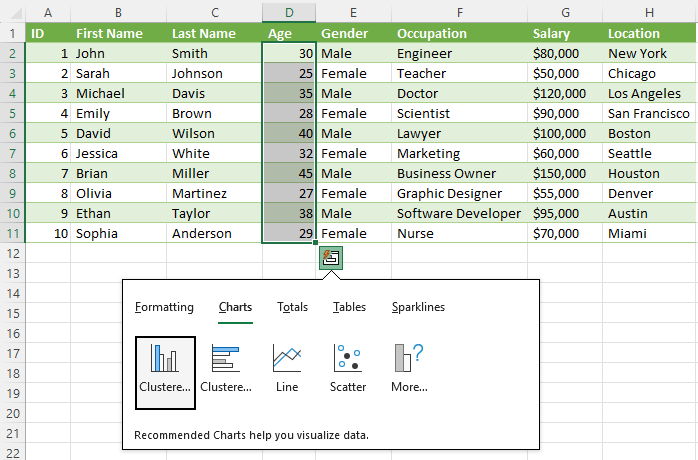
Data Visualizations:
There are the days when you have to decode long lists of numbers. Quick Analysis Tool Excel enables users to create visualizations with charts in just a click. Also, this tool supports various visualizations such as bar charts and pie graphs. Therefore, such visual representations enhance information comprehension and make it easier for decision-makers within the shortest possible time frames to get information simplified.
Customization for Reporting:
This feature is not just a data visualization tool but also a system allowing the user to change the visualizations. Charts have many options including column data on the right corner and it will tell you when you move into the chart tab it will show different kinds of charts according to your data.
It can be customized in different ways such as changing colors, inserting labels, and refining chart items. It makes your reports accurate and beautiful.
In-Depth Analysis:
This Tool is not only about appearances but it also provides insight into deep analysis. Utilizing sparklines, data bars, and conditional formatting, patterns, and trends in the data can be identified by users. This implies that professionals will be able to find some underlying hidden pieces of information from the larger set of complex information.
Integration of Excel Functions:
The compatibility of the Quick Analysis Tool in Excel with functions is very beneficial. With this tool, users can combine data visualizations and analytics with formulas and functions from Excel. This will not only expand the functionality of this tool but also allow users to take full advantage of the comprehensive data analysis provided by Excel.
Making of Decision
There is often not much time allowed us to make decisions. However, among the Quick Analysis Tool’s many features, real-time updates to visualizations are quite prominent. Whenever data changes, charts and graphs change as well so that decision-makers always have access to the most current information. This tool can be a great help in such a case where business results are influenced by a fast informed decision-making process.
Conclusion:
In conclusion, this tool makes the process of data visualization easy and fast. With this tool, you can easily convert raw data into beautiful visualizations that make reporting a hassle-free process and allow people to easily obtain useful findings. It should not be ignored by businesses.
Read Also: Top 6 Courses To Excel As An Entrepreneur